Sarah Kliff on Female Mortality Rates
Matthew Martin
4/04/2013 11:54:00 PM
Tweetable
Kliff left me wondering why we are looking specifically at female mortality rates, rather than pooled men and women. Following the link to Austin Frakt provides a bit more clarity--"female mortality rates increased in 42.8% of counties (male mortality rates increased in only 3.4%)."
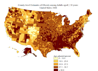
My first impression from Kliff's piece was how closely the chart of female mortality matches the chart of obesity rates by county for both men and women (stolen from Cornell economist Jon Cawley by way of a couple other sources)
As you can see, county-by-county obesity rates closely track increases in female mortality rates. This graph doesn't tell you how the obesity rates changed over time, but what you need to know is that the counties that currently have the highest obesity rates are generally also the ones that have observed the most growth in obesity over time, not surprisingly.
I'm certainly not making a causal argument here--it could simply be that the same socio-economic factors increasing female mortality are also causing obesity rates to rise, for example. Nor do I have any theory why high obesity rates would be so much more highly correlated with changes in female than male mortality rates.

